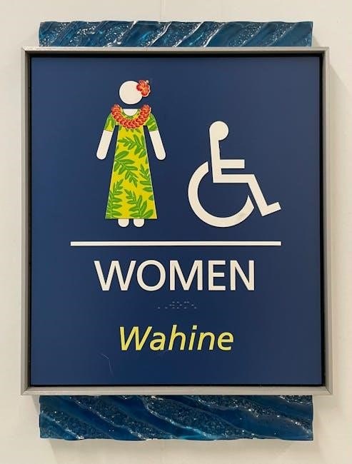
User guide icons are visual elements that simplify complex information, enhancing navigation and communication in interfaces. They play a crucial role in tutorials, documentation, and user experience design.
1.1 Definition and Purpose of User Guide Icons
User guide icons are visual symbols designed to communicate instructions, navigation, or actions within a system or document. Their primary purpose is to simplify complex information, enhance usability, and provide quick visual cues for users. These icons are essential for tutorials, quick start guides, and documentation, ensuring users can easily understand and interact with the content.
1.2 Importance of Icons in User Interfaces
Icons in user interfaces are vital for enhancing usability and accessibility. They convey complex information succinctly, reduce cognitive load, and improve visual appeal. Icons also facilitate quick decision-making, guide user navigation, and ensure consistency across platforms. Their strategic use can significantly improve overall user experience, making interfaces more intuitive and user-friendly.

Designing User Guide Icons
Designing user guide icons requires clarity, consistency, and creativity. Use design tools to craft icons that align with brand identity and platform guidelines for optimal effectiveness.
2.1 Essential Principles of Icon Design
Effective icon design relies on simplicity, consistency, and scalability. Icons should be intuitive, avoiding clutter, with clear visual hierarchy. Use universal symbols and ensure they are legible across sizes and devices. Color and contrast must enhance recognition while maintaining brand coherence. Adherence to platform guidelines ensures seamless integration and optimal user experience across applications.
2.2 Popular Styles and Trends in Icon Design
Current trends include minimalism, flat design, and glassmorphism for a modern look. Variable fonts and micro-interactions are gaining traction, enhancing user engagement. Custom illustrations and 3D icons are also popular, offering unique brand identity. These styles ensure icons remain visually appealing while maintaining functionality, adapting seamlessly to diverse user guide applications and digital platforms.
Using Icons in User Guides
Icons in user guides enhance comprehension by simplifying complex instructions. They provide visual cues, making content more engaging and easier to follow for all users universally.
3.1 Best Practices for Icon Placement
Place icons strategically to enhance user guide clarity. Ensure consistency in size and style, aligning them with relevant text or actions. Use icons near buttons or instructions they represent. Maintain sufficient spacing to avoid visual clutter. Test icons across devices to ensure legibility and universal understanding. Consider cultural differences and accessibility to make icons intuitive for all users globally.
3.2 How Icons Enhance User Experience
Icons simplify navigation, making user guides more intuitive. They reduce text clutter, allowing users to grasp information quickly. Universal symbols bridge language barriers, enhancing cross-cultural communication. Icons also improve accessibility for visually impaired users and provide visual cues for complex instructions. By leveraging human recognition of shapes and colors, icons create a seamless and engaging user experience across diverse platforms and audiences.

Sources for High-Quality User Guide Icons
High-quality user guide icons are available from royalty-free libraries, design platforms, and creative marketplaces like iStock, Shutterstock, and Canva, offering customizable options for consistency and clarity.
4.1 Royalty-Free Icon Libraries
Royalty-free icon libraries offer cost-effective solutions for sourcing high-quality user guide icons. Platforms like iStock, Shutterstock, and Canva provide extensive collections with flexible licensing. These libraries ensure legal compliance and customization options, making them ideal for consistent and professional designs across various projects. They cater to diverse needs, from web to mobile applications, ensuring enhanced visual communication and user experience.
- Access to diverse icon styles and formats.
- Cost-effective and flexible licensing options.
- Customization possibilities for brand consistency.
4.2 Tools for Creating Custom Icons
Tools like Adobe Illustrator, Figma, and Canva enable designers to create custom icons. These platforms offer vector graphics, customization, and cross-platform compatibility. They are ideal for both professionals and beginners, ensuring icons are tailored to specific design needs, enhancing user guides with unique and cohesive visuals.
- Adobe Illustrator: Industry-standard for vector icon creation.
- Figma: Collaborative design with real-time feedback.
- Canva: User-friendly for quick icon customization.

Customizing User Guide Icons
Customizing user guide icons allows for tailored visuals. Tools like Figma enable adjustments in color, shape, and size, enhancing clarity and engagement while maintaining brand consistency.
5.1 Personalizing Icons for Brand Consistency
Personalizing icons ensures alignment with brand identity. By adjusting colors, styles, and shapes, icons can reflect a company’s visual language. Tools like Adobe Illustrator and Figma offer features to customize icons, maintaining consistency across all platforms and enhancing recognition. This step is crucial for creating a cohesive user experience.
5.2 Adding Animations and Interactivity
Animations and interactivity enhance user engagement, making icons dynamic and responsive. Techniques like hover effects, click animations, and state changes provide visual feedback, improving usability. Tools such as CSS, JavaScript, and After Effects allow designers to create smooth transitions and micro-interactions, enriching the user experience without compromising functionality.

Icon Usage in Different Platforms
Icons are optimized for various platforms, ensuring consistency and visual appeal across web, mobile, and desktop applications, with platform-specific design standards.
6.1 Icons for Web Design
Icons in web design enhance user experience by providing visual cues for navigation and actions. They are typically scalable, ensuring clarity on various screen sizes. Popular formats like SVG and PNG are widely used for their quality and responsiveness. High-quality icons, available in styles from flat to material design, can be customized using tools like Canva or Figma to match brand aesthetics, improving overall web interface usability.
6.2 Icons for Mobile Applications
Icons in mobile apps must be optimized for touch interactions, with clear visuals and appropriate sizes. They should adhere to platform-specific guidelines, like iOS and Android standards, ensuring consistency and usability. High-quality, scalable icons enhance app performance and user engagement, while vector graphics maintain sharpness across devices, making them essential for modern mobile interface design and functionality.

Legal and Licensing Considerations
Understanding licensing terms and avoiding copyright infringement are crucial when using icons. Ensure compliance with royalty-free or paid licenses to protect both users and creators legally.
7.1 Understanding Icon Licensing Terms
Icon licensing terms define how icons can be used, ensuring legal compliance. Royalty-free licenses allow unlimited use without fees, while others may require attribution or restrict commercial use. Always review terms to avoid infringement and ensure proper usage rights for your projects, whether personal or professional. Compliance protects both creators and users legally.
7.2 Avoiding Copyright Infringement
Avoiding copyright infringement requires using icons legally, either by purchasing licenses or using royalty-free resources. Always verify the source and licensing terms before use. Using unlicensed icons can lead to legal consequences. Ensure proper attribution when required and respect intellectual property rights to maintain credibility and avoid disputes. This protects both creators and users in legal matters.

Future Trends in User Guide Icons
Future trends include AI-driven icon personalization and adaptive designs for cross-platform compatibility, ensuring icons remain intuitive and visually appealing across diverse devices and interfaces.
8.1 The Role of AI in Icon Design
AI is revolutionizing icon design by enabling rapid creation of personalized, scalable, and adaptive icons. It automates iterative processes, suggests design variations, and ensures consistency across platforms, enhancing user experience while reducing manual effort.
8.2 Adaptive Icons for Cross-Platform Compatibility
Adaptive icons ensure seamless compatibility across diverse platforms by automatically adjusting their appearance based on device specifications. They utilize layered designs, allowing them to adapt to different screen resolutions and operating systems, ensuring a consistent and polished user experience while maintaining brand integrity.

Cultural and Accessibility Considerations
Cultural and accessibility considerations ensure icons are inclusive and universally understood. Designs must respect diverse audiences while adhering to accessibility standards, ensuring clarity and usability for all users globally.
9.1 Designing Icons for Global Audiences
Designing icons for global audiences requires careful consideration of cultural differences and universal symbolism. Simple, intuitive designs ensure accessibility and understanding across diverse user groups. Avoiding cultural biases and ensuring visual clarity are essential. Universal symbols transcend language barriers, making icons effective worldwide. Appropriate color choices enhance accessibility and ensure compliance with global standards, ensuring usability for everyone.
9.2 Ensuring Accessibility in Icon Design
Accessibility in icon design involves ensuring visibility and readability. High contrast ratios aid users with visual impairments. Clear shapes and simple forms improve comprehension. Providing alternative text for icons enhances screen reader compatibility. Testing with accessibility tools ensures compliance with standards like WCAG. Designing with these considerations ensures inclusivity and usability for all users, making interfaces more accessible globally.

Case Studies and Examples
Successful implementations of user guide icons include Google’s Material Symbols and the FF Netto icon set, which enhance user experience through clear, intuitive visual communication.
10.1 Successful Icon Implementations in User Guides
Google’s Material Symbols and the FF Netto icon set exemplify successful implementations. These icons use consistent styles and scalable designs, ensuring clarity across platforms. Their intuitive visuals guide users seamlessly, enhancing overall navigation and engagement in digital interfaces. Such examples demonstrate how well-crafted icons can elevate user guides to new effectiveness levels. They are benchmarks for modern design.
10.2 Lessons Learned from Icon Design Failures
Icon design failures often stem from excessive complexity or lack of scalability. Inconsistent designs across platforms confuse users, while cultural insensitivity can lead to misinterpretation. Oversights in accessibility, like insufficient contrast or lack of alt text, alienate users. These mistakes highlight the importance of thorough testing and user feedback to ensure icons are clear, inclusive, and universally effective.
Tools and Resources
Discover essential tools for icon design, such as Adobe Illustrator, Figma, and Canva, offering robust features for creating and editing icons. Explore online communities like Dribbble for inspiration and resources to enhance your icon design projects.
11.1 Recommended Software for Icon Design
Adobe Illustrator and Figma are top choices for icon design, offering advanced vector tools and collaboration features. Canva provides user-friendly templates, while Sketch and Inkscape are excellent alternatives. These tools enable precise control over shapes, colors, and scalability, ensuring high-quality icons for user guides. Each software caters to different skill levels, from professionals to beginners, streamlining the design process.
11.2 Online Communities for Icon Designers
Online communities like Dribbble and Behance offer platforms for icon designers to showcase their work, share ideas, and gain feedback. These spaces foster collaboration, inspire creativity, and provide access to resources and trends. Joining such communities helps designers refine their skills, stay updated on industry standards, and connect with peers and potential clients worldwide.
User guide icons are essential for enhancing user experience, providing quick access to information, and ensuring intuitive navigation in digital interfaces, evolving with design trends and supporting tutorials and documentation.
12.1 The Evolution of User Guide Icons
User guide icons have transformed from simple symbols to detailed, high-resolution visuals, adapting to design trends and technological advancements. Early icons were basic, while modern designs emphasize clarity and aesthetics, leveraging vector graphics and AI tools for precision and customization, ensuring accessibility and cultural relevance for global audiences.
12.2 The Future of Icon Design in User Guides
The future of icon design in user guides lies in AI-driven personalization, adaptive icons, and enhanced interactivity. Vector graphics and high-resolution formats will dominate, ensuring clarity across devices. Animations and micro-interactions will add depth, while accessibility and cultural inclusivity remain priorities. These advancements will make icons more intuitive and engaging, seamlessly integrating into global user experiences and documentation.
 pocket guide to adoration
  tv guide greenville sc
  bottom guide for sliding shower doors
  harvest right troubleshooting guide
  tails noir trophy guide
  san francisco travel guide map
  small manual transmission
  mass of creation pdf
  four winns service manual pdf free